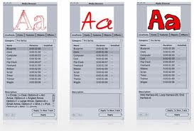
In the lesson I used the LiveType software to make a proto-type for our main title of the film. We have not chosen a name yet so we used 'The Resistance' as an example. I used historic font that uses very dynamic detail and shapes to make it seem more creative. I used a deep red colour to reflect the genre of the movie, the colour is symbolic to blood and power.

LIVETYPE
Whilst the Macs where stolen. we where unable to edit, therefore I decided to get on with other things so we where not too far behind when the deadline came. Using the Livetype software I looked at a variety of different styles, colours and edits. I decided that using red would be the best associated colour to the genre of our film; Horror. Red represents danger, blood and gore, it is also deep and representative to the sequence that is about to occur. The style that appealed most to me, was 'Frigid' this made our opening sequence name 'The resistance' move slight;y left to right in a fast awkward movement. I thought this mocked the struggle to survive from the kidnapper as Emily; the victim of his evil antics latches on to the door trying to escape but struggles. The editing movement replicates that struggle as it represents panic and distress.
No comments:
Post a Comment